Principles of good web design bring an interesting perspective for the websites that a business needs to reach more reach and sales in their conversion funnel.
PetstarsCo is a brand that offers dog walking and dog training. Instead, a lot of pet owners ask for accessories, clothes, and accessories for their pets.
After watching the customer’s need for these products, PetstarsCo and Barkybutt established September a cobranding with a 25% coupon off with the code PETSTARSCO.
This coupon has been used for some clients, but at the moment isn’t giving favorable results in revenue. After analyzing the design decision for the website, I would like to purpose some changes to reach more views on this page.
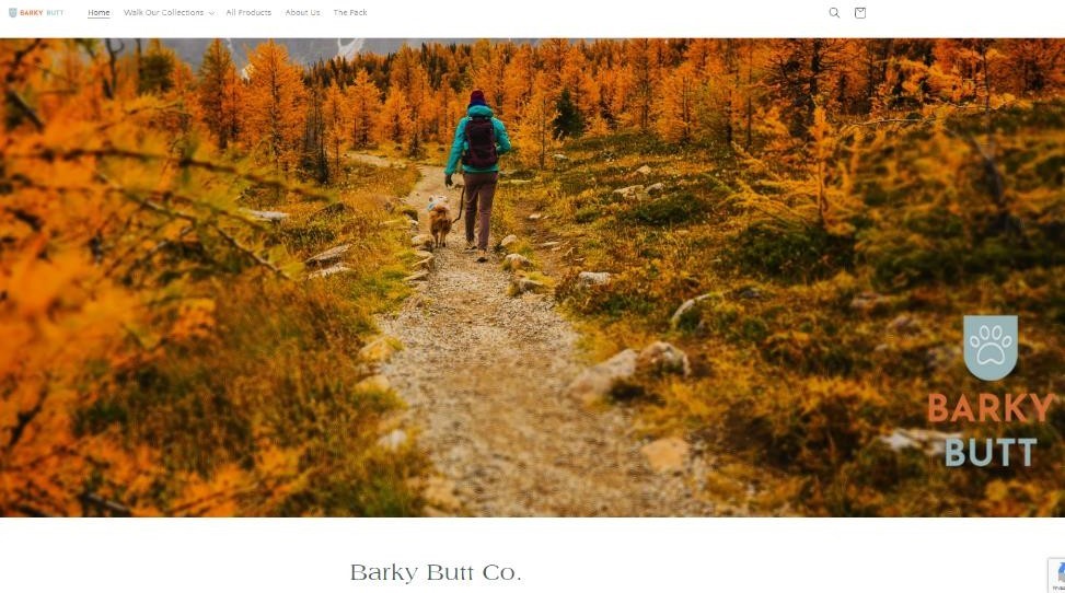
Improve visual hierarchies: This website could engage more people in the tech products for dogs. I recommend using different typographies and reducing the size of the image at home to maintain more engagement.

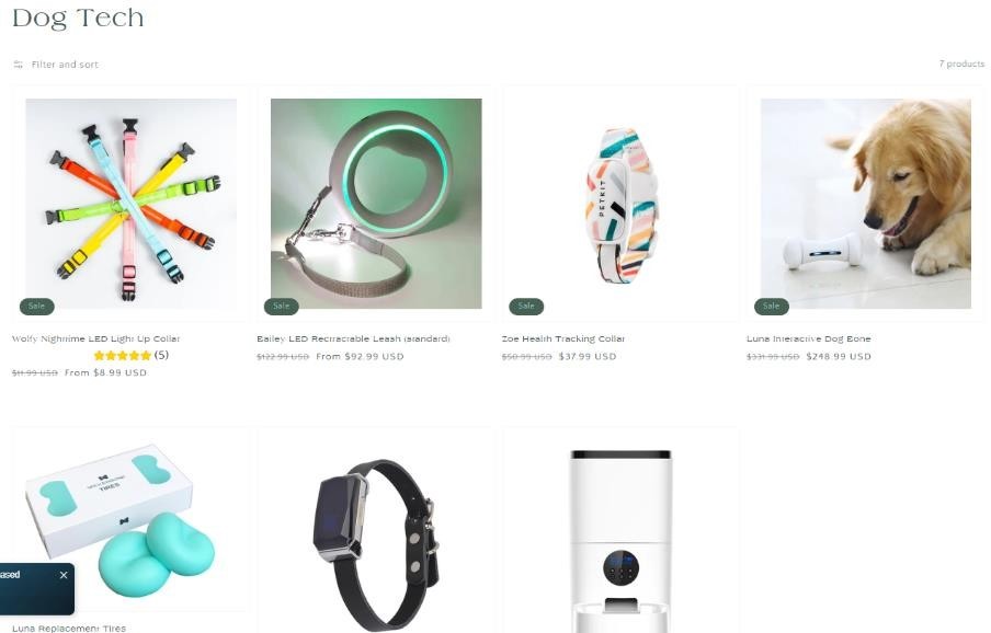
Attention: The call to action for Barky could improve the tech dog products because that is their main product. Also, for selling, the commission raises.

With this example for my own company, I took into account that these guidelines could help professionals to improve conversion rates and identify potential buyers in different areas of their business.


