My favorite holiday is approaching! Halloween season starts with a lot of events that involve families, friends, and pets. According to business insider, consumers are expected to spend a record $10.14 billion on Halloween this year.
For that reason, products and services started events in different segments. I´ve been the Head of Public Relations for Children’s Sport, a brand that offered services for babies and children in swimming, early stimulation, and magic dance.
This year, I planned an event for babies, which is the first time that we will develop an event for this target. That will be on October 22th and involve visual elements in the development to engage customers.
The sales goal is 24 babies, and the design elements take a crucial part previous to launching the event to the customers. Halloween always is related to palette colors such as orange and black, dark backgrounds, etc.
However, in this case, is related to babies. For that reason, the design team, change the perspective, and Marketing and PR decide on the key visual. In this sense, an element of perspective helps PR to share and sell the event in media, the perspective, palette, lines, and association change.


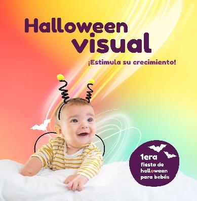
Taking into account that the marketing goal is acquiring new customers, we decided on the second ad. My decision is based on the yellow and blue palette, the relation with the brand image, and new Halloween perspective for this target. To sum up, design elements help to make smart and effective choices that reach the common goal of the agency.